A hallway does more work than most rooms in the house. It is the first space you see when you come in, the route between rooms, and usually one of the hardest areas to keep looking fresh. That is why the best hallway paint ideas are not just about picking a nice colour. They need to handle daily wear, work with limited natural light, and set the tone for the rest of the property.
The right paint choice can make a narrow corridor feel wider, a dark entrance feel brighter, and a tired space feel properly finished. It can also hide scuffs better, create a cleaner look around woodwork, and give the whole home a stronger sense of flow. In a busy family house, a rental property or a shared entrance, those details matter.
What makes the best hallway paint ideas work?
Hallways are different from lounges and bedrooms because they are pass-through spaces. You rarely stand still in them, which means colour is experienced quickly. Strong tones can feel dramatic and stylish, but in a narrow or poorly lit hallway they can also feel heavy if they are not balanced properly.
Light levels are usually the biggest factor. Many hallways in London homes have little direct daylight, so a paint shade that looks soft in a showroom can appear dull or grey once it is on the wall. That does not mean you must paint everything white. It means the undertone matters. Warm neutrals, soft greiges, muted greens and carefully chosen deeper shades often perform better than stark brilliant white.
Durability matters just as much as appearance. Hallways take knocks from bags, shoes, pushchairs and general day-to-day traffic. A beautiful flat matt finish might look excellent on day one, but if it marks too easily, it quickly becomes a maintenance issue. In most cases, a durable matt or washable finish is the better long-term choice.
Best hallway paint ideas for different spaces
Soft off-whites for dark or narrow hallways
If your hallway lacks natural light, a soft off-white is often the safest and smartest route. The key word is soft. Pure bright white can feel cold and clinical, especially alongside older woodwork, warm lighting or period features. Off-whites with a creamy, chalky or slightly greige base usually create a more welcoming result.
This works particularly well in Victorian and Edwardian properties where the hallway may be slim, tall and shaded. It lifts the walls without making the space feel harsh. Pairing these tones with crisp but not brilliant white ceilings and tidy woodwork gives the hallway a cleaner, brighter structure.
Warm greige for a calm, modern look
Greige sits between grey and beige, which makes it one of the most flexible hallway colours. It gives enough warmth to stop the space feeling sterile, while still looking neat and contemporary. If you want a hallway that flows easily into modern kitchens, living rooms or open-plan spaces, greige is often a strong choice.
It also hides everyday marks better than very pale shades. That practical advantage is easy to overlook at first, but it makes a real difference in busy homes. For landlords and homeowners preparing a property for a refresh, this can be one of the most balanced options.
Sage and muted green for a softer statement
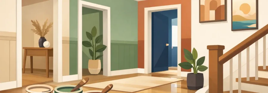
Green works particularly well in hallways because it feels grounded without being overpowering. A muted sage or dusty olive can add personality while still keeping the space calm. It is a good option if you want more character than a neutral but do not want to commit to something too dark.
This kind of colour works well with timber details, black ironmongery and natural flooring. It also suits homes where the hallway leads into rooms with warmer palettes, because it bridges classic and modern styles very comfortably.
Mid-tone blue for depth without heaviness
Blue can be a strong hallway colour when used with care. Mid-tone, muted blues often give enough depth to make the space feel intentional, but without closing it in. This is especially useful in wider hallways or entrance areas that need more identity.
The trade-off is light. In a very enclosed hallway, blue can feel cooler than expected, so it needs testing in the actual property before committing. Good lighting and well-finished trim make a big difference here.
Earthy taupe for warmth and durability
Taupe is one of the most dependable colours for hardworking spaces. It brings warmth, feels settled, and tends to hide scuffs better than lighter shades. In family homes and rental properties, that practicality is valuable.
It also pairs well with carpet runners, timber stairs and painted panelling. If you want something understated that still feels designed, taupe is often a better choice than plain beige.
Charcoal or deep green for period drama
Some hallways benefit from going darker, not lighter. In larger entrance halls or period homes with high ceilings, a charcoal, deep green or smoky navy can create real presence. Used well, darker shades make features such as mouldings, staircases and picture rails stand out beautifully.
The important point is proportion. In a small hallway with low ceilings, covering every surface in a very dark paint may feel oppressive. In those cases, darker colours often work better on lower panelling, a feature wall or the staircase side, balanced with lighter upper walls.
Using paint to improve the shape of a hallway
The best hallway paint ideas are not always about the shade alone. Placement matters. If the hallway is long and narrow, painting the end wall in a slightly deeper tone can visually shorten the space and make it feel more balanced. If the ceiling feels low, carrying a lighter tone upwards helps create more height.
Painted panelling is another effective approach. It adds character, protects the lower wall, and gives the space a more finished look. In practical terms, it also helps in busy properties where lower walls are more likely to take knocks. A darker panel with a lighter upper wall often creates the right mix of style and resilience.
Woodwork should not be an afterthought. Skirting, door frames and banisters have a major effect on the final look. Matching trim to the wall colour gives a softer, more contemporary feel, while contrasting trim creates a sharper, more traditional finish. Neither is always right. It depends on the age of the property, the amount of natural light and the effect you want.
Finish matters as much as colour
Even the best colour choice can disappoint if the finish is wrong. Hallways need paint that can cope with regular cleaning and everyday use. A quality durable matt is often the best balance because it keeps the look soft while offering better washability than standard matt.
For woodwork, a tougher finish is usually worth it. Banisters and handrails in particular need proper preparation and a finish that stands up to repeated contact. That is where workmanship matters. Uneven sanding, poor masking or rushed coats show up quickly in a hallway because the space is seen so often and from so many angles.
Common mistakes with hallway paint
One of the biggest mistakes is choosing a colour in isolation. A hallway connects the whole house, so it needs to sit comfortably with the rooms leading off it. That does not mean everything must match, but the transition should feel considered.
Another common issue is relying on one tester view. Paint looks different in daylight, under evening lamps, and beside flooring or stair carpet. Testing a few options on more than one wall gives a much clearer picture.
Finally, many people underestimate preparation. Hallways often have old scuffs, hairline cracks, previous filler marks and uneven surfaces. Fresh paint will not hide poor background work. In fact, it often highlights it.
Choosing the right idea for your property
If your priority is brightness, start with warm off-whites or light greiges. If you want more character, look at muted green, taupe or blue. If the hallway has good proportions and period detail, darker colours may give the best result of all.
The right answer depends on how the space is used, how much light it gets, and what kind of atmosphere you want as soon as the front door opens. In homes across Southgate, Palmers Green, Cockfosters, Barnet and Enfield, we often see the same pattern: the hallway gets overlooked, even though it influences the feel of the entire property. When it is painted properly, with the right colour and finish, the whole home feels more polished and better cared for.
A hallway should do more than connect rooms. It should welcome you in, stand up to daily life, and make the rest of the house look better from the moment you step through the door.